Styling Tkinter Treeview with ttk.Style
";require "templates/body_start.php";?>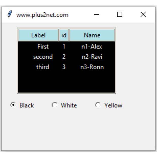
Tkinter Treeview is a themed ttk widget, so its appearance is normally controlled through ttk.Style. We can change row colors, fonts, row height, heading appearance and selected-row colors.
For individual rows, Treeview tags provide another level of styling without changing the appearance of the complete widget.
style.configure() for the widget's normal appearance, style.map() for state-dependent appearance such as selection, and Treeview tags for selected rows or groups of rows.Basic Treeview Style 🔝
Create a ttk.Style object and configure the Treeview style.
from tkinter import ttkstyle=ttk.Style()style.configure('Treeview', background='black', fieldbackground='black', foreground='white')This default style is used by Treeview widgets that do not specify another style.
'Treeview' can affect every Treeview widget in the application that uses the default Treeview style.Treeview Background and Foreground 🔝
style.configure('Treeview', background='black', fieldbackground='black', foreground='white')| Option | Purpose |
|---|---|
background | Normal background used by Treeview items. |
fieldbackground | Background of the Treeview field, including unused empty space. |
foreground | Normal text color. |
See Tkinter colors for more color values.
Style Treeview Headings 🔝
Column headings use a separate style named Treeview.Heading.
style.configure('Treeview.Heading', background='PowderBlue', foreground='black', font=('Arial', 11, 'bold'))This changes heading appearance without changing row appearance.
Change Treeview Font 🔝
font1=('Times', 12, 'normal')style.configure('Treeview', font=font1)The heading font can be different:
style.configure('Treeview.Heading', font=('Times', 12, 'bold'))Change Treeview Row Height 🔝
style.configure('Treeview', rowheight=30)This is useful when Treeview rows use a larger font or images.
rowheight applies to rows using that style. Treeview does not normally calculate a different row height automatically for each item.Change Selected Row Colors with style.map() 🔝
Selection is a widget state, so use style.map() instead of only style.configure().
style.map('Treeview', background=[('selected', 'navy')], foreground=[('selected', 'white')])When the user selects a row, the mapped values are applied.
Create a Custom Style for One Treeview 🔝
If only one Treeview should receive a special appearance, create a named style instead of changing the default Treeview style.
style.configure('Custom.Treeview', background='#202020', fieldbackground='#202020', foreground='white', rowheight=28)style.configure('Custom.Treeview.Heading', background='PowderBlue', foreground='black', font=('Arial', 11, 'bold'))tree=ttk.Treeview(root, style='Custom.Treeview')The naming pattern is important:
Custom.TreeviewCustom.Treeview.HeadingThis lets the heading style belong to the same custom Treeview style.
Style Individual Treeview Rows with Tags 🔝
ttk.Style controls the widget, while Treeview tags can style particular items.
tree.tag_configure('high', background='lightgreen', foreground='black')tree.tag_configure('low', background='mistyrose', foreground='black')tree.insert('', tk.END, values=(1, 'Alex', 88), tags=('high',))tree.insert('', tk.END, values=(2, 'Ravi', 35), tags=('low',))This is useful for highlighting status, marks, warnings or alternating rows.
Alternating Row Colors
tree.tag_configure('even', background='#f2f2f2')tree.tag_configure('odd', background='white')for i, row in enumerate(data): tag='even' if i%2==0 else 'odd' tree.insert('', tk.END, values=row, tags=(tag,))Change Treeview Style using RadioButtons 🔝
Three Radiobuttons can let the user switch between black, white and yellow Treeview backgrounds.
A StringVar stores the selected color.
color_var=tk.StringVar(value='black')The update function reads that variable:
def update_style(): color=color_var.get() if color=='black': bg, fg='black', 'white' elif color=='yellow': bg, fg='yellow', 'black' else: bg, fg='white', 'black' style.configure('Custom.Treeview', background=bg, fieldbackground=bg, foreground=fg)The Radiobuttons can use the same command:
tk.Radiobutton(root, text='Black', variable=color_var, value='black', command=update_style)tk.Radiobutton(root, text='White', variable=color_var, value='white', command=update_style)tk.Radiobutton(root, text='Yellow', variable=color_var, value='yellow', command=update_style)Complete Treeview Style Example 🔝
import tkinter as tkfrom tkinter import ttkdef update_style(): color=color_var.get() if color=='black': bg, fg='black', 'white' elif color=='yellow': bg, fg='yellow', 'black' else: bg, fg='white', 'black' style.configure('Custom.Treeview', background=bg, fieldbackground=bg, foreground=fg)root=tk.Tk()root.geometry('440x300')root.title('Treeview Style - plus2net')style=ttk.Style(root)style.theme_use('clam')style.configure('Custom.Treeview', background='black', fieldbackground='black', foreground='white', font=('Times', 12), rowheight=28)style.configure('Custom.Treeview.Heading', background='PowderBlue', foreground='black', font=('Arial', 11, 'bold'))style.map('Custom.Treeview', background=[('selected', 'navy')], foreground=[('selected', 'white')])tree=ttk.Treeview(root, columns=('id', 'name'), show='tree headings', selectmode='browse', height=5, style='Custom.Treeview')tree.grid(row=0, column=0, columnspan=3, padx=30, pady=20)tree.column('#0', width=90, anchor='center')tree.column('id', width=60, anchor='center')tree.column('name', width=140, anchor='center')tree.heading('#0', text='Label')tree.heading('id', text='ID')tree.heading('name', text='Name')tree.insert('', tk.END, text='First', values=(1, 'Alex'))tree.insert('', tk.END, text='Second', values=(2, 'Ravi'))tree.insert('', tk.END, text='Third', values=(3, 'Ron'))color_var=tk.StringVar(value='black')tk.Radiobutton(root, text='Black', variable=color_var, value='black', command=update_style).grid(row=1, column=0)tk.Radiobutton(root, text='White', variable=color_var, value='white', command=update_style).grid(row=1, column=1)tk.Radiobutton(root, text='Yellow', variable=color_var, value='yellow', command=update_style).grid(row=1, column=2)root.mainloop()ttk Themes and Treeview Styling 🔝
The active ttk theme can influence how styles are rendered.
List Available Themes
print(style.theme_names())A sample result can include themes such as:
('clam', 'alt', 'default', 'classic')The exact available themes depend on the operating system and Tcl/Tk installation.
Check the Current Theme
print(style.theme_use())Use the clam Theme
style.theme_use('clam')The clam theme is often used in styling examples because custom colors tend to be more predictable than with some operating-system-native themes.
Common Treeview Styling Mistakes 🔝
1. Changing the Default Style when Only One Treeview Should Change
This:
style.configure('Treeview', background='black')may affect all Treeview widgets using the default style.
Use:
style.configure('Custom.Treeview', background='black')tree=ttk.Treeview(root, style='Custom.Treeview')2. Styling Selected Rows with configure()
Selection is a state, so use:
style.map('Custom.Treeview', background=[('selected', 'navy')])3. Using ttk.Style for One Individual Row
Use Treeview tags instead:
tree.tag_configure('warning', background='yellow')4. Mixing Heading and Row Styles
Rows use:
Custom.TreeviewHeadings use:
Custom.Treeview.Heading5. Expecting Every Theme to Display Colors Identically
ttk styling is theme-based. Native themes can render some states differently.
6. Using an Invalid show Value
For both the tree column and headings use:
show='tree headings'Tkinter Treeview Style Summary 🔝
ttk.Stylecontrols Treeview appearance.backgroundcontrols normal item background.fieldbackgroundcontrols the Treeview field background.foregroundcontrols normal text color.Treeview.Headingstyles column headings.fontchanges the Treeview row font.rowheightcontrols row height.style.map()controls appearance for states such asselected.- A custom style can be applied to only one Treeview.
- Treeview tags style individual items or groups of rows.
- Radiobuttons can dynamically update Treeview styles.
- The active ttk theme can affect how custom styles are displayed.