HTML <dialog> Tag: Native Modal and Non-Modal Dialogs
The HTML <dialog> element creates a native dialog box. Use showModal() when the user must interact with the dialog before returning to the page, or show() for a non-modal dialog.
For most cases, pair the element with a clearly labeled button, provide an obvious way to close it, and keep important page content outside the dialog unless the interaction genuinely requires a modal.
Basic modal dialog Top ↑
<button type="button" id="openDialog">Open dialog</button>

<dialog id="myDialog">
  <h2>Confirm action</h2>
  <p>Continue with this action?</p>
  <button type="button" id="closeDialog">Close</button>
</dialog>
const dialog = document.getElementById('myDialog');
document.getElementById('openDialog').addEventListener('click', () => {
dialog.showModal();
});
document.getElementById('closeDialog').addEventListener('click', () => {
dialog.close();
});showModal() opens the dialog as a modal. The rest of the document becomes inactive until the dialog is closed.
showModal(), show(), and close() Top ↑
dialog.showModal()opens a modal dialog.dialog.show()opens a non-modal dialog and leaves the rest of the page interactive.dialog.close()closes an open dialog. An optional return value can be supplied.
dialog.show();

dialog.close('confirmed');
console.log(dialog.returnValue);
Use a modal only when the task requires the user's attention before they continue. For ordinary information, inline content or a non-modal disclosure may be less disruptive.
Close a dialog with a form Top ↑
A form inside a dialog can use method="dialog". Submitting that form closes the dialog without sending the form data to a server.
<dialog id="confirmDialog">
  <form method="dialog">
    <p>Delete this item?</p>
    <button value="cancel">Cancel</button>
    <button value="delete">Delete</button>
  </form>
</dialog>
The selected button's value becomes the dialog's returnValue. If the action must update server data, handle that separately and validate it on the server.
The open attribute Top ↑
The Boolean open attribute controls whether a dialog is displayed. However, for modal dialogs, prefer showModal() instead of manually adding open, because modal behavior involves more than visibility.
<dialog open>
  This dialog is displayed as a non-modal dialog.
</dialog>
Style dialog and backdrop with CSS Top ↑
dialog {
  padding: 1.25rem;
  border: 1px solid #ccc;
  border-radius: 0.5rem;
  max-width: 32rem;
}

dialog::backdrop {
  background: rgb(0 0 0 / 0.5);
}
The ::backdrop pseudo-element applies only when a dialog is shown in the top layer, such as with showModal().
Complete dialog example Top ↑
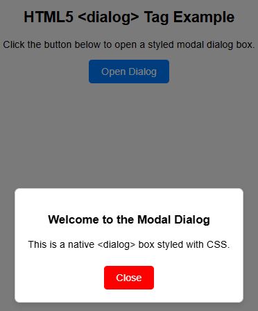
<!DOCTYPE html>
<html lang="en">
<head>
  <meta charset="UTF-8">
  <meta name="viewport" content="width=device-width, initial-scale=1">
  <title>HTML dialog example</title>
  <style>
    dialog {
      padding: 1.25rem;
      border: 1px solid #ccc;
      border-radius: 0.5rem;
      max-width: 30rem;
    }
    dialog::backdrop {
      background: rgb(0 0 0 / 0.5);
    }
  </style>
</head>
<body>
  <button type="button" id="openDialog">Open dialog</button>

  <dialog id="myDialog">
    <h2>Welcome</h2>
    <p>This is a native modal dialog.</p>
    <button type="button" id="closeDialog">Close</button>
  </dialog>

  <script>
    const dialog = document.getElementById('myDialog');
    document.getElementById('openDialog').addEventListener('click', () => dialog.showModal());
    document.getElementById('closeDialog').addEventListener('click', () => dialog.close());
  </script>
</body>
</html>
Accessibility guidance Top ↑
- Use modal dialogs only when they are necessary for the task.
- Give the dialog a clear heading and concise purpose.
- Provide an obvious close or cancel control unless the user must complete a required decision.
- Do not remove visible focus indicators from interactive controls.
- Return focus logically after the dialog closes, especially when custom scripting changes the normal interaction flow.
- Do not rely on a dialog alone to make an interaction accessible; labels, instructions, keyboard usability, and error handling still matter.
When to use <dialog> Top ↑
Good uses include confirmations, short focused forms, settings panels, and decisions that temporarily interrupt the main task. Avoid using a modal for content that could simply appear in the page, especially if users need to compare it with surrounding information.
Dialog vs details Top ↑
Use <details> when users should expand or collapse supporting content within the document. Use <dialog> when the content is a separate interaction, especially when modal behavior is required.
Related JavaScript behavior Top ↑
Dialogs are controlled with JavaScript methods and events. Continue with JavaScript events or JavaScript functions when building reusable dialog controls.
Common mistakes Top ↑
- Using
openas a replacement forshowModal()when true modal behavior is required. - Opening every popup as a modal even when the user should still interact with the page.
- Providing no clear way to cancel or close the dialog.
- Putting important primary page content only inside a dialog.
- Assuming native HTML removes the need for accessibility testing.
- Using inline JavaScript everywhere instead of reusable event listeners.
Frequently asked questions Top ↑
How do I open an HTML dialog as a modal? Top ↑
Call the dialog element's showModal() method. This places it in the top layer and prevents interaction with the rest of the document until it closes.
How do I open a non-modal dialog? Top ↑
Use show(). The dialog is displayed, but the rest of the page remains interactive.
How do I close a dialog? Top ↑
Call dialog.close(), submit a form using method="dialog", or provide another supported close interaction.
Can a dialog return a value? Top ↑
Yes. Pass a value to close() or use buttons inside a method="dialog" form, then read the dialog's returnValue.
Should important SEO content be placed only inside a dialog? Top ↑
No. A dialog is an interaction component, not an SEO technique. Keep essential page information easy for users to find in the normal document flow unless it genuinely belongs inside the interaction.
HTML5 Tags Types of HTML tags
Subhendu Mohapatra
Author & Instructor at plus2net
I write and maintain practical tutorials on Python, PHP, SQL, JavaScript, HTML, jQuery, and web development at plus2net. The tutorials focus on clear explanations, working examples, and code that readers can test and adapt while learning.